The design system was built for product consistency and to express the brand value through visuals. Furthermore, increasing efficiency in an agile pace environment helps the UX team produce mockups and prototypes rapidly.
To define the brand value proposition, I hosted a workshop to find the best term to describe what our unit cares about the most. I used the golden circle model: “ why’ how, what” to differentiate the brand value from competitors, I found this is a great thinking process for most of everything. Finally, the team came out with the words and phrases that can deliver the brand value: trustworthy, intelligent, agile. Provide solutions with AI tech to solve complex problems.
To generate the visual element to deliver the brand value, we collected the symbol to represent these words then put images that could deliver the vibe of the words and symbols the most together to build an imageboard. Once the imageboard was ready we extracted the visual elements from these images to create the basic visual foundation.
The UX team created 5 sets of proposals and 3 of them are quite similar which means the UI elements are well-defined. My design got selected through several votes, to ease the effort of every designer, we decided to integrate all the styles of the current projects at that time. The goal was to accelerate the design process.

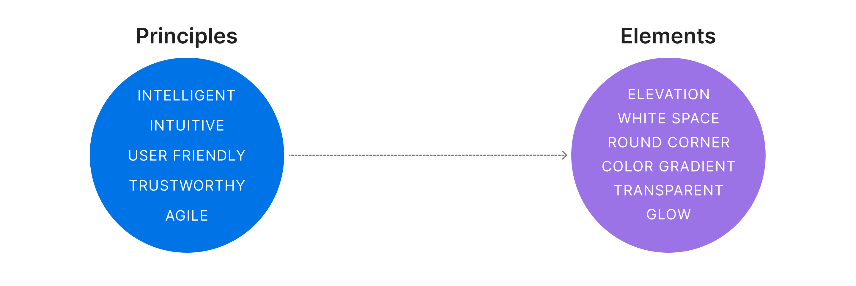
The iteration is to have more brand identity UI since we weren't putting too much effort into style so the UI consistency is still not good enough. The brand value is defined, so I align the design principle with the brand value and made some improvements based on the last version's feedback and inputs from every project. The design principles of this iteration are:
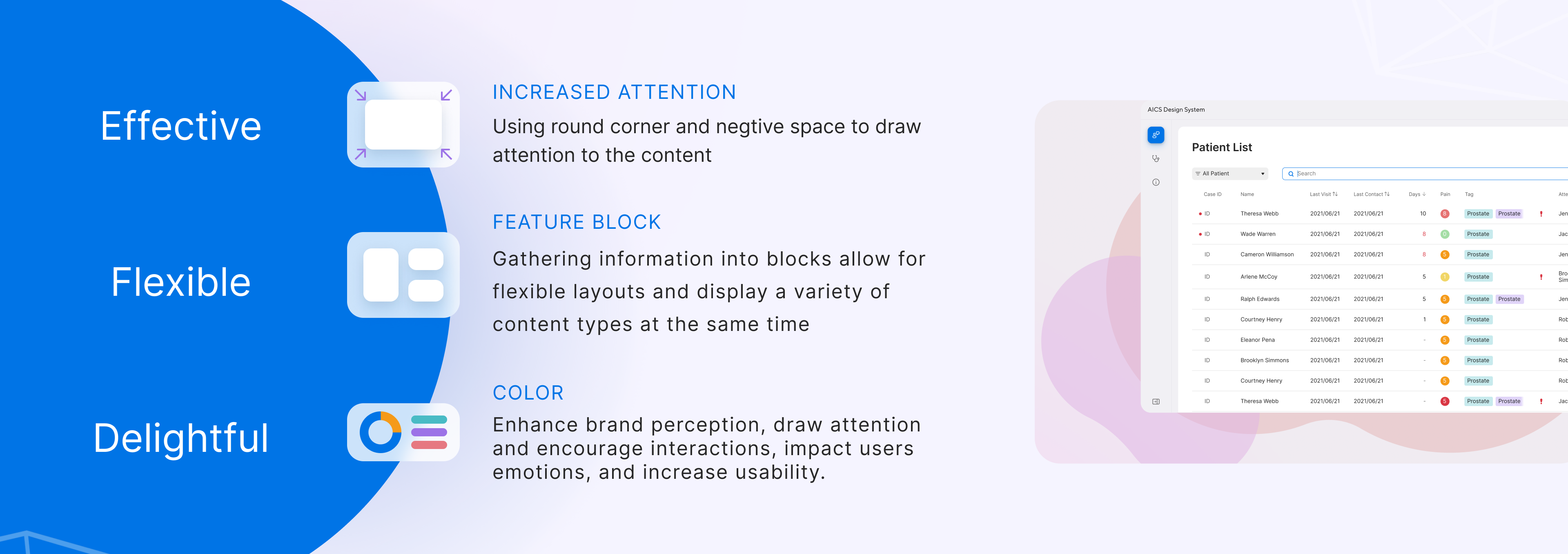
To increase the readability I use a round corner section and white space to draw attention. These 2 elements were proved to increase the readability and give the user a more natural movement while scanning content.
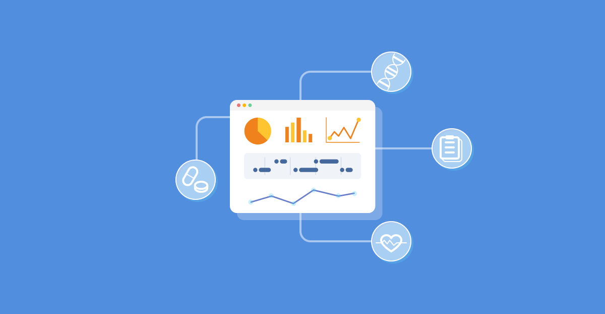
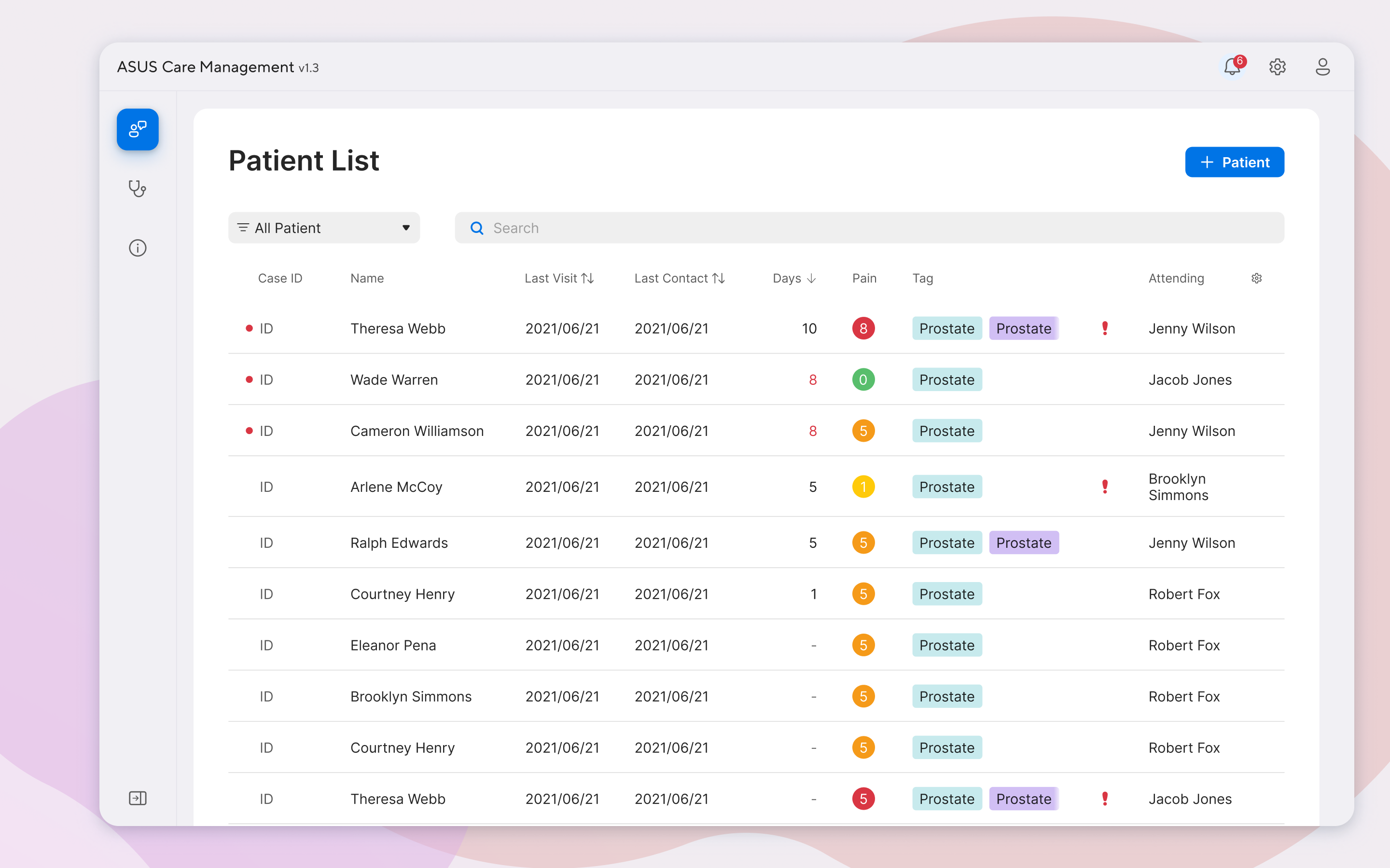
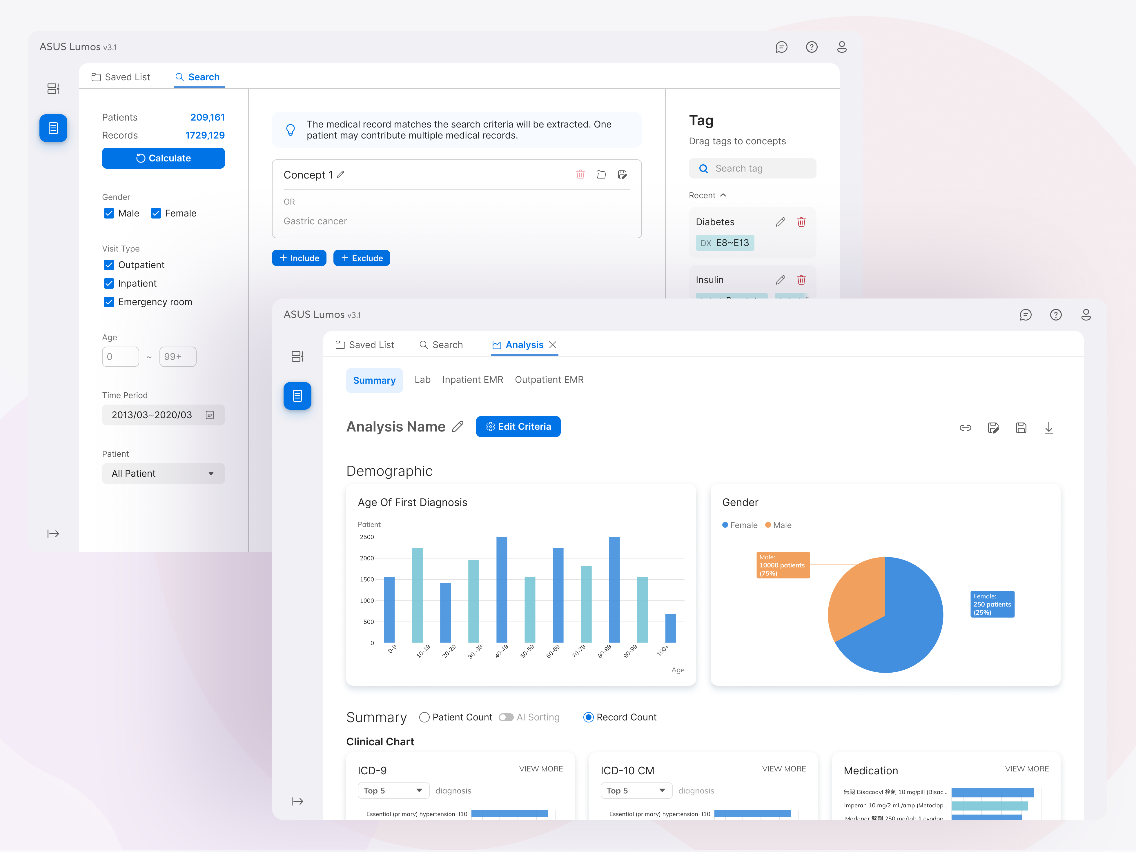
The designers often received different requests, for the expert tools it's important to have a customized workspace to accelerate the workflow. And this design should be able to apply to all the products to be adaptable to different platforms and resolutions.
Adding well-defined palettes for each scenario, I've defined the status color and excluded these colors from other palettes, for tags and chart the user won't see these colors with strong meaning so they will receive the important information just by a glance without misleading. The error and empty status use the new design elements to make the experience more consistent and delightful. Micro animation to draw attention more properly and smoothly.
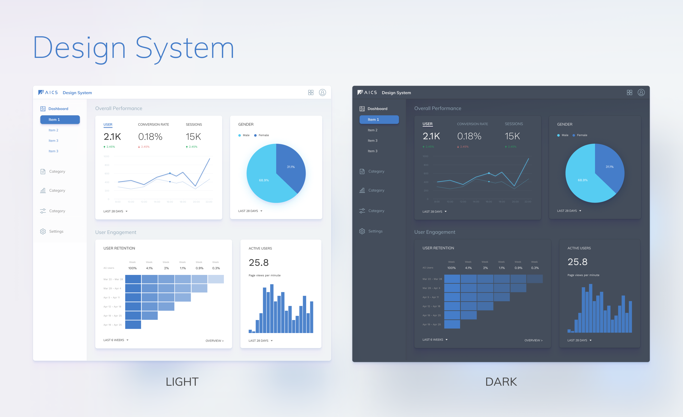
Although the first version didn’t have a strong brand identity, we did achieve the goal to increase the design process efficiency by using a defined component. The new iteration is more focused on visual improvements to have a more consistent and delightful design. It's difficult to have a new iteration based on the original design since it has various style combinations for ease of effort reason. So we first apply to only 1 product at the beginning and adjusted it to see if it's adaptive. Once it passed user testing we stated to apply to each product one at a time in consideration of the effort that might cost for every product and the design system will have improvements during each product.
Contact me via this form